TEMPLATES
WPF allows you to completely change the visual appearance of a control and representation or Structure of data. Templates in WPF allow you to fully change the UI of anything.
2 types of Templates are there in WPF:
- Data Template
- Control Template
Data Template
Data Template defines the structure and appearance of data. It represents the visual representation of data. Basically, what you put into a Data Template determines what the data looks like in the rendered application.
So it is very much understood from the above defination that “Content” of a control is its Data. So to define the appearance of the data, you can use a Data Template.
It provides the flexibility to format and define the presentation of the data on any UI element. It is mostly used on data related Item Controls such as ComboBox, ListBox, etc.
Let us understand it through an example:
[XAML]
<Window x:Class="WpfApplication1.MainWindow"
xmlns="http://schemas.microsoft.com/winfx/2006/xaml/presentation"
xmlns:x="http://schemas.microsoft.com/winfx/2006/xaml"
Title="DataTemplateDemo" Height="350" Width="525">
<Grid>
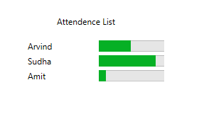
<Label Height="40" Margin="193,39,191,240">Attendence List</Label>
<ItemsControl Name="AttendenceList" Width="200" Height="200" Margin="157,79,160,40">
<ItemsControl.ItemTemplate>
<DataTemplate>
<Grid Margin="0,0,0,5">
<Grid.ColumnDefinitions>
<ColumnDefinition Width="*" />
<ColumnDefinition Width="100" />
</Grid.ColumnDefinitions>
<TextBlock Text="{Binding Name}" />
<ProgressBar Grid.Column="1" Minimum="0" Maximum="100" Value="{Binding Attendence}" />
</Grid>
</DataTemplate>
</ItemsControl.ItemTemplate>
</ItemsControl>
</Grid>
</Window>
[XAML.cs]
using System.Collections.Generic;
using System.Windows;

namespace WpfApplication1
{
    /// <summary>
    /// Interaction logic for MainWindow.xaml
    /// </summary>
    public partial class MainWindow : Window
    {
        public MainWindow()
        {
            InitializeComponent();
            List<employee> items = new List<employee>();
            items.Add(new employee() { Name = "Arvind", Attendence = 45 });
            items.Add(new employee() { Name = "Sudha", Attendence = 80 });
            items.Add(new employee() { Name = "Amit", Attendence = 10 });
            AttendenceList.ItemsSource = items;
        }
    }
    public class employee
    {
        public string Name { get; set; }
        public int Attendence { get; set; }
    }
}
The Output window is shown below:
Control Templates
Templates defines structure and appearance of control. The control functionality remains same, but their appearance is changed.
For Example : You can change the default appearance of a button to a circle or ecllipse but the functionality remains the same.
The concept of Control Template is shown below:
<Window x:Class="WpfApplication1.MainWindow"
     xmlns="http://schemas.microsoft.com/winfx/2006/xaml/presentation"
     xmlns:x="http://schemas.microsoft.com/winfx/2006/xaml"
     Title="DataTemplateDemo" Height="350" Width="525">
    <Window.Resources>
        <ControlTemplate x:Key="TextboxTemplate" TargetType="TextBox">
            <Grid>
                <Ellipse Height="100" Width="150">
                    <Ellipse.Fill>
                        <LinearGradientBrush StartPoint="0,0" EndPoint="0,1">
                            <GradientStop Offset="0" Color="Yellow" />
                            <GradientStop Offset="1" Color="Aqua" />
                        </LinearGradientBrush>
                    </Ellipse.Fill>
                </Ellipse>
                <ContentPresenter Content="{TemplateBinding Text}"
                                  HorizontalAlignment="Center"
                                  VerticalAlignment="Center" >
                </ContentPresenter>
            </Grid>
        </ControlTemplate>
    </Window.Resources>
    <StackPanel Margin="0,80,0,50">
        <TextBox Text="Textbox"  Width="130" Height="30" ></TextBox>
        <TextBox Text="Textbox" Width="150" Height="110" Template="{StaticResource TextboxTemplate}"></TextBox>
    </StackPanel>
</Window>
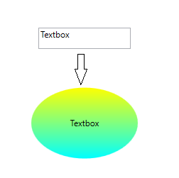
In the above figure you can see that with the help of control template, the default appearance of textbox can be fully changed to ellipse. But the functionality of texbox is remain intact. Like this you can also change the appearance of other UI controls like Buttons etc.